Reading American Stock Charts Made Easy for New Investors


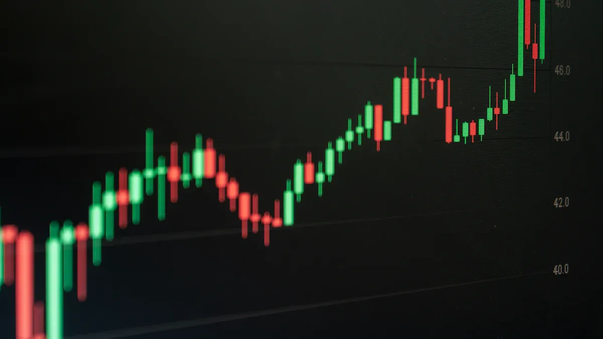
Image Source: pexels
Does a stock chart look like a confusing jumble of lines? You are not alone. Many people feel intimidated by charts. However, their main job is simple. Charts show you four key pieces of information about an American stock price: the open, high, low, and close. This beginner guide makes reading stock charts easy.
While charts are powerful tools, remember that some studies show investors using technical analysis can underperform. This guide focuses on foundational knowledge.
This guide helps you understand what the colors and bars on charts mean. You can start learning the story these charts are telling.
Key Takeaways
- Stock charts show you four key prices: open, high, low, and close. They help you understand how a stock’s price changes over time.
- Candlestick charts are the most popular type. They use colors and shapes to show if a stock’s price went up or down.
- Trading volume tells you how many shares were bought or sold. High volume makes price changes more important.
- Always look for the main trend of a stock. You can also find support and resistance levels where prices often stop or turn around.
- Use tools like Simple Moving Averages (SMA) and Relative Strength Index (RSI). They help confirm trends and show if a stock is bought or sold too much.
Anatomy of a Stock Chart

Image Source: unsplash
Before you can read the story of an American stock price, you need to know the language. The anatomy of a stock chart is your dictionary. It breaks down into a few simple components that work together to give you a clear picture of market activity. Let’s dissect a basic stock chart.
Understanding American Stock Price and Time Axes
Think of a stock chart as a map. Every map needs a grid to help you find your location. On a stock chart, this grid is made of two axes:
- The Vertical Axis (Y-Axis): This is the price axis. It shows you the American stock price. The higher up on the chart, the higher the price.
- The Horizontal Axis (X-Axis): This is the time axis. It shows you the period you are looking at. Time moves from left to right, showing you price history from the past to the most recent moment.
Together, these axes let you pinpoint an American stock price at a specific moment in time.
The Three Main Chart Types
You will encounter several chart types on platforms like Biyapay, but most new investors only need to know three. Each tells the same story but with a different level of detail.
Before you pick a chart type, it helps to make the “what am I looking at?” step effortless. You can use BiyaPay’s Stock Info to pull up the specific U.S. stock you want to study, get a quick sense of its price range and volatility, and then decide whether a line chart is enough for the trend or a candlestick view is better for breaking down the open-high-low-close.
If you’re also thinking about how funding or allocation looks across currencies, you can pair that with the free FX Converter & Comparison for a real-time conversion check—so your “price move” and your “money move” stay consistent. For broader navigation and account-level context, you can start from the BiyaPay website.
- Line Chart: This is the simplest of the stock market charts. It connects a series of closing prices with a single line. You can easily see the general direction and trend of an American stock price over time. A rising line shows an increasing trend, while a falling line shows a downward trend.
- Bar Chart (OHLC Chart): This chart gives you more data. Each bar shows you the Open, High, Low, and Close (OHLC) prices for the period. It consists of a vertical line with two small horizontal ticks. The top of the line is the high, the bottom is the low, the left tick is the opening price, and the right tick is the closing price.
- Candlestick Chart: This is the most popular type of chart for active traders. A candlestick chart also shows the OHLC prices but in a more visual way. Its colorful body makes it easy to see if the price went up or down in a period. We will dive deeper into the candlestick chart next.
| Chart Type | Best For | Downside |
|---|---|---|
| Line Chart | Seeing the big-picture trend quickly. | Lacks detail (no high, low, or open). |
| Bar Chart | Viewing OHLC data clearly. | Can look cluttered and less intuitive than a candlestick chart. |
| Candlestick Chart | Instantly seeing price direction and momentum. | Can be overwhelming at first due to patterns. |
Reading a Candlestick
The candlestick chart is the foundation of modern technical analysis. Each “candle” is a snapshot of the price action for one period (like a day or an hour). Understanding its parts is crucial.
A candlestick is made of a body and two wicks (or shadows). These parts represent four key data points: the Open, Close, High, and Low.
- The Body: This is the thick, rectangular part. It shows you the range between the opening and closing price.
- A green (or white) body means the stock closed higher than it opened. Buyers were in control.
- A red (or black) body means the stock closed lower than it opened. Sellers were in control.
- The Wicks (Shadows): These are the thin lines extending above and below the body.
- The Upper Wick shows the highest price the stock reached during the period. A long upper wick suggests buyers tried to push the price up but failed.
- The Lower Wick shows the lowest price the stock reached. A long lower wick suggests sellers tried to push the price down but buyers fought back.
Groups of candles form candlestick patterns, which can help you anticipate potential price moves. You don’t need to memorize them all, but knowing a few common ones is helpful. These candlestick patterns give clues about market sentiment.
| Pattern Type | Common Examples | What It Suggests |
|---|---|---|
| Bullish (Up) | Hammer, Bullish Engulfing, Morning Star | A potential end to a downtrend; buying pressure is increasing. |
| Bearish (Down) | Shooting Star, Bearish Engulfing, Evening Star | A potential end to an uptrend; selling pressure is increasing. |
Learning to read a candlestick chart is like learning to read body language. Each candle on the candlestick chart tells a story of the battle between buyers and sellers. A series of long green candles on a candlestick chart indicates strong buying pressure, while a series of red candles on a candlestick chart signals strong selling pressure. The candlestick chart provides a powerful visual summary of market activity. You can use a candlestick chart to understand trends and make decisions. A candlestick chart helps you identify entry and exit points. The candlestick chart is a key tool for risk management.
The Role of Trading Volume
At the bottom of most charts, you will see a series of vertical bars. This is the trading volume. Volume tells you how many shares were traded during a specific period. Think of it as the crowd’s roar—a loud roar means lots of people are involved.
Volume is critical because it helps you confirm the strength of a price move. A price change on high volume is more significant than one on low volume.
| Volume Level | Price Movement | What It Indicates |
|---|---|---|
| High Volume | Price Moves Up | Strong buying interest; the uptrend is likely to continue. |
| High Volume | Price Moves Down | Strong selling pressure; the downtrend is confirmed. |
| Low Volume | Price Moves Up | Weak buying interest; the move may not be sustainable. |
| Low Volume | Price Moves Down | Weak selling conviction; the trend might be losing steam. |
Always check the volume on your stock chart. It adds context to the price movements you see on the candlestick chart and other charts. It is a fundamental part of analyzing any basic stock chart.
Mastering the Basics of Reading Stock Charts
Now that you understand the individual parts of a stock chart, you can learn to interpret the story they tell. Mastering the basics means moving beyond identifying a single candle and learning to see the bigger picture. This involves recognizing patterns in price action, understanding market psychology, and using simple tools to confirm your observations. These are the core trends beginners should look for when starting their journey in technical analysis.
Identifying the Overall Trend
The most fundamental skill in reading charts is identifying the overall trend. The trend tells you the general direction the stock’s price is heading. Think of it like a staircase.
- Uptrend (Climbing Stairs): An uptrend consists of a series of higher highs and higher lows. Each time the price pulls back, it finds a bottom at a higher level than before. This shows that buyers are in control.
- Downtrend (Descending Stairs): A downtrend is the opposite. You will see a series of lower highs and lower lows. The stock chart will slope downwards, showing descending peaks and troughs. This indicates sellers are dominant. You can often confirm this by drawing a downward-sloping trendline that connects the falling highs on the candlestick chart.
- Sideways Trend (A Flat Hallway): Sometimes, a stock trades within a range, without making significant new highs or lows. This is a sideways or “ranging” market, where buyers and sellers are in a state of equilibrium.
Finding Support and Resistance Levels
As a stock price moves, it often seems to hit invisible barriers. These are known as support and resistance levels. Understanding them helps you anticipate where the price might pause or reverse.
Support is like a price floor. It is a price level where a stock has trouble falling through because demand (buying interest) is strong enough to overcome supply (selling pressure).
Resistance is like a price ceiling. It is a price level that a stock struggles to break above because selling pressure outweighs buying interest.
| Level Type | Analogy | What It Means | How It Forms |
|---|---|---|---|
| Support | Price Floor | A zone where buying pressure tends to stop a price decline. | Traders remember this level from the past and see it as a good value, creating demand. |
| Resistance | Price Ceiling | A zone where selling pressure tends to stop a price increase. | Traders who bought at a lower price take profits, or those who bought at this level before want to sell and break even. |
These levels become stronger for a few key reasons. Widespread recognition of these zones creates a self-fulfilling dynamic, as many traders place orders around them. You will often see higher trading volume near these levels, which confirms their importance. Additionally, prices often find support or resistance at round numbers like $50 or $100 due to psychological factors. When you look at charts, try to draw horizontal lines connecting multiple price peaks (resistance) or troughs (support) to visualize these key zones.
Using Simple Moving Averages
A candlestick chart can look choppy from day to day. A Simple Moving Average (SMA) is a tool that smooths out this price data to help you see the underlying trend more clearly. It calculates the average closing price over a specific number of periods and plots it as a single line on your candlestick chart.
You do not need to calculate it yourself; charting platforms do it for you. You just need to know which ones to use.
- 50-Day SMA: This reflects about 10 weeks of price action. Short-term traders watch this to gauge intermediate-term momentum.
- 200-Day SMA: This covers nearly a full trading year. Long-term investors use it to assess the major, long-term trend. A price above its 200-day SMA is generally considered to be in a healthy long-term uptrend.
A key signal to watch for is a moving average crossover.
- A Golden Cross occurs when the shorter-term 50-day SMA crosses above the longer-term 200-day SMA. Investors see this as a bullish signal, suggesting an upward trend is beginning.
- A Death Cross happens when the 50-day SMA crosses below the 200-day SMA. This is a bearish signal, indicating a potential downward trend.
These signals are especially useful for analyzing larger, more stable companies. You can use them to help time your entry and exit points on various charts.
Gauging Momentum with RSI
Have you ever wondered if a stock has gone up too far, too fast? Or if it has fallen too much? The Relative Strength Index (RSI) is a popular momentum indicator that helps you answer this. It is shown as a line graph below your main candlestick chart and oscillates between 0 and 100.
The RSI’s calculation is based on the average gains and average losses over a set period, typically 14 days. Its purpose is to measure the speed and change of price movements. For a new investor, you only need to focus on two key levels:
- Overbought (RSI Above 70): When the RSI moves above 70, it suggests the stock is “overbought.” This means buying has been aggressive, and the stock might be due for a pause or a pullback in price. It does not automatically mean you should sell, but it signals a need for caution.
- Oversold (RSI Below 30): When the RSI drops below 30, it suggests the stock is “oversold.” Selling has been heavy, and the stock might be due for a bounce. This could signal a potential buying opportunity for those looking for a bargain.
Like all indicators, the RSI is not a foolproof crystal ball. It is a tool that adds valuable context to the price action you see on the candlestick chart. By combining trend analysis, support/resistance, and indicators like RSI, you can build a more complete picture from the charts you are reading.
How to Read Trading Charts: A 4-Step Process
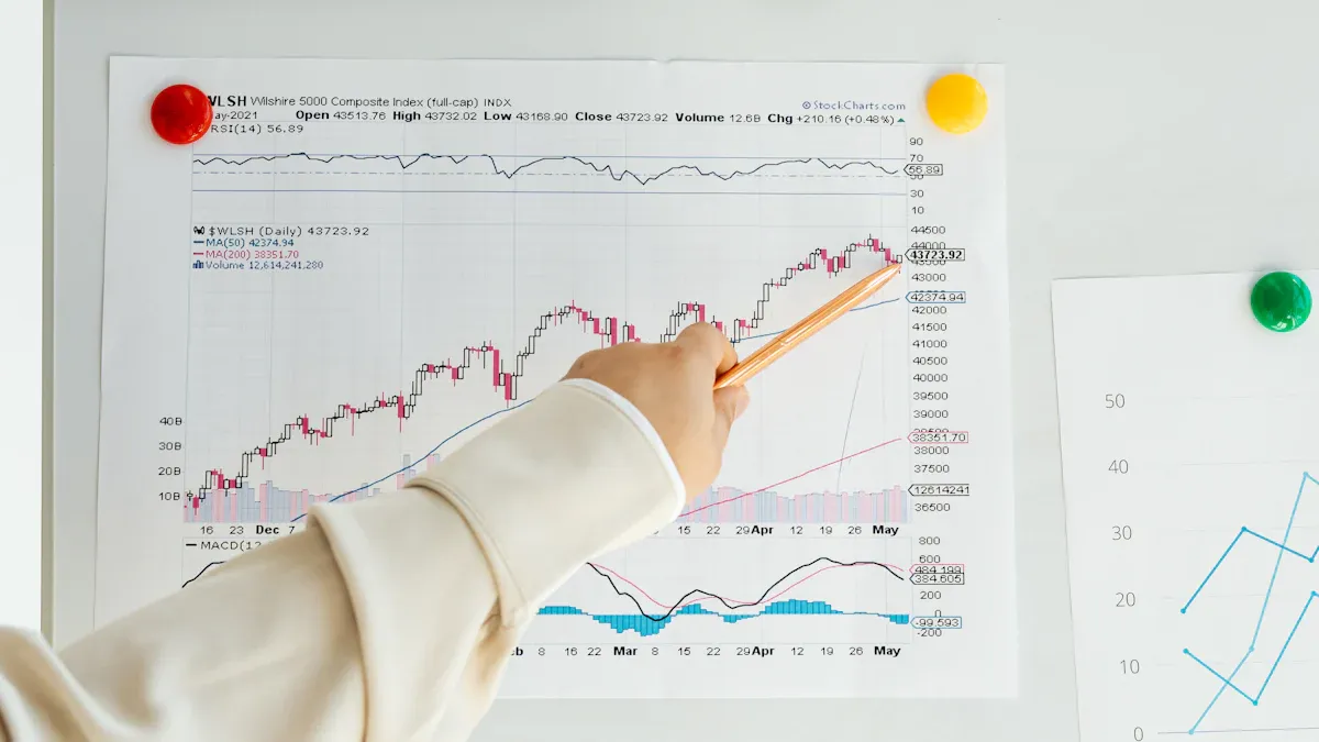
Image Source: pexels
You now have the building blocks. This simple 4-step process will teach you how to read trading charts methodically. Following these steps helps you build a consistent routine for analyzing any stock.
Step 1: Set Your Timeframe
First, you must choose the right timeframe for your goals. Your selection depends on your trading style. Short-term day traders might use 5-minute charts, while long-term investors often rely on daily or weekly charts to see the bigger picture. Many investors consult daily, weekly, and monthly charts to pinpoint the best entry and exit points.
Tip: You can easily change the timeframe on most charting platforms. Look for buttons labeled “1D” (1 Day), “1W” (1 Week), or “1M” (1 Month) near the top or bottom of the candlestick chart.
Step 2: Determine the Main Trend
Next, identify the stock’s primary direction. You can do this by drawing a trendline. To draw an uptrend line, you need to connect at least two swing lows on the candlestick chart. A third touch of the line validates its strength. For a downtrend, you connect two or more swing highs. You can also use the 200-day Simple Moving Average (SMA) for confirmation. A price trading above its 200-day SMA is generally in a long-term uptrend. Analyzing the trend on your candlestick chart is a crucial step.
Step 3: Spot Key Price Levels
After finding the trend, you should look for major support and resistance levels. These are the price floors and ceilings we discussed earlier. You can find them by drawing horizontal lines that connect multiple past peaks or troughs on the candlestick chart. When a price breaks through resistance, that level can become the new support. Likewise, a broken support level can turn into future resistance. These levels on the charts show you where battles between buyers and sellers might happen.
Step 4: Check Volume for Confirmation
Finally, always check the trading volume. Volume confirms the strength behind a price move. A breakout on high volume is much more significant than one on low volume. When you read stock charts, look for a surge in volume when the price breaks a key level on the stock chart. This tells you many traders support the new price direction.
| Breakout Type | Volume Level | What It Suggests |
|---|---|---|
| Strong Breakout | High Volume | The move has conviction and is likely to continue. |
| Weak Breakout | Low Volume | The move lacks participation and may fail or reverse. |
This final check on the candlestick chart adds a layer of confidence to your analysis of the charts.
Reading a candlestick chart is a skill you develop with practice, not a secret code. Understanding the relationship between price, trend, and volume on a candlestick chart is the foundation of technical analysis. Now, it is your turn to practice. Open one of the free charting tools below and look up a familiar American stock like Apple (AAPL).
Try to identify the trend on the candlestick chart. Find a single candlestick’s body. Look at the volume bars on the charts. These simple observations on the charts turn theory into practice. Analyzing charts gets easier with every candlestick chart you review. These charts will become clearer over time.
FAQ
Which chart type is best for a beginner?
You will find candlestick charts most useful. They visually show the open, high, low, and close prices. The colors make it easy to see price direction and market sentiment at a glance. Most investors prefer them for their detailed view.
Can I rely on just one indicator like RSI?
No, you should never rely on a single indicator. Indicators like RSI and SMA are tools for confirmation, not crystal balls. You should always use them with price action, trend analysis, and volume. This approach provides a more complete picture of the stock’s behavior.
What is the best timeframe to use on a chart?
The best timeframe matches your investment style. Long-term investors often use daily or weekly charts to see the big picture. Short-term traders might use 5-minute or 15-minute charts. You should start with a daily chart to learn the basics of trend analysis.
*This article is provided for general information purposes and does not constitute legal, tax or other professional advice from BiyaPay or its subsidiaries and its affiliates, and it is not intended as a substitute for obtaining advice from a financial advisor or any other professional.
We make no representations, warranties or warranties, express or implied, as to the accuracy, completeness or timeliness of the contents of this publication.
Related Blogs of

What Are the Daily Limits for Chase Accounts?


How Safe Is Your Money With Ally Bank in 2026?


The 18 Best Apps to Earn Real Cash This Year


Zelle Wire Transfer or ACH? Clearing Up the Confusion

Choose Country or Region to Read Local Blog

Contact Us


BIYA GLOBAL LLC is a licensed entity registered with the U.S. Securities and Exchange Commission (SEC No.: 802-127417); a certified member of the Financial Industry Regulatory Authority (FINRA) (Central Registration Depository CRD No.: 325027); regulated by the Financial Industry Regulatory Authority (FINRA) and the U.S. Securities and Exchange Commission (SEC).
BIYA GLOBAL LLC is registered with the Financial Crimes Enforcement Network (FinCEN), an agency under the U.S. Department of the Treasury, as a Money Services Business (MSB), with registration number 31000218637349, and regulated by the Financial Crimes Enforcement Network (FinCEN).
BIYA GLOBAL LIMITED is a registered Financial Service Provider (FSP) in New Zealand, with registration number FSP1007221, and is also a registered member of the Financial Services Complaints Limited (FSCL), an independent dispute resolution scheme in New Zealand.