Must-Read for Investing in US Stocks in 2025: 5 Technical Indicator Tips for Analyzing Real-Time Quotes


Image Source: pexels
When facing the rapidly changing US stock market, do you often feel overwhelmed by information and struggle to make decisions? A survey shows that 16% of retail investors admit to being overwhelmed by massive news information. This feeling is very common. When analyzing US stock real-time quotes, too much data can indeed be overwhelming.
This article aims to provide you with clear guidance. We will introduce five market-proven practical technical indicator tips. The focus is on “practical application” rather than empty theory. You will learn methods that can be used immediately to help you quickly interpret stock price trends, thereby improving the quality of your trading decisions.
Key Takeaways
- Market action discounts everything, and prices already reflect all information. You should learn to interpret price action.
- Prices evolve in trends, and once a trend forms, it will continue. You should go with the market trend.
- History repeats itself, driven by human emotions in the market. You should identify recurring chart patterns.
- A single indicator has limitations; you should combine multiple indicators to verify signals. For example, you can use trend indicators and momentum indicators together.
- You should choose time frames based on your trading style. When indicators give conflicting signals, you should wait patiently.
Technical Analysis Basics: Understanding the Core Principles of Price Action
Before diving into specific indicators, you need to master the three cornerstones of technical analysis. These principles, derived from Dow Theory, form the logical foundation of all chart analysis. Understanding them will help you interpret the market language more deeply.
Core Principle 1: Market Action Discounts Everything
This principle states that the current stock price has already digested all known information. Whether it’s company earnings reports, macroeconomic data, or overall investor sentiment, all factors are already reflected in the price.
You can hardly gain a trading edge by reading news or company financial reports. Because by the time you see the information, countless savvy investors have already analyzed it and incorporated it into the stock price through buying and selling.
This means the price itself is the most comprehensive information carrier. For example, when a company announces an acquisition or releases better-than-expected earnings, its stock price often adjusts within minutes or hours. Therefore, what you need to do is not argue with the market about whether the price is “correct,” but learn to interpret price action itself.
Core Principle 2: Prices Evolve in Trends
Stock price movements are not completely random but form trends. Once a trend forms, it tends to continue in the original direction until a clear reversal signal appears. Trends are mainly divided into three types:
- Uptrend: A series of higher highs and higher lows.
- Downtrend: A series of lower lows and lower highs.
- Sideways Trend: Prices fluctuate within a certain range without a clear direction.
For example, the US S&P 500 Index entered a long-term uptrend after 2011. Despite pullbacks along the way, the overall direction remained upward. Identifying and following the main trend is the core strategy in technical analysis trading.
Core Principle 3: History Repeats Itself
The core of this principle lies in human psychology. The basic emotions driving the market—greed and fear—have remained unchanged for centuries. Because human behavior repeats, the price chart patterns formed by these behaviors also recur.
Technical analysis is based on the study of these recurring patterns. Classic chart formations, such as “head and shoulders top,” appeared before major market turning points like the 2000 internet bubble burst and the 1929 stock market crash. By identifying these historically validated patterns, you can better predict potential future market turning points.
Tip 1: Using Moving Averages (MA) to Analyze US Stock Real-Time Quotes
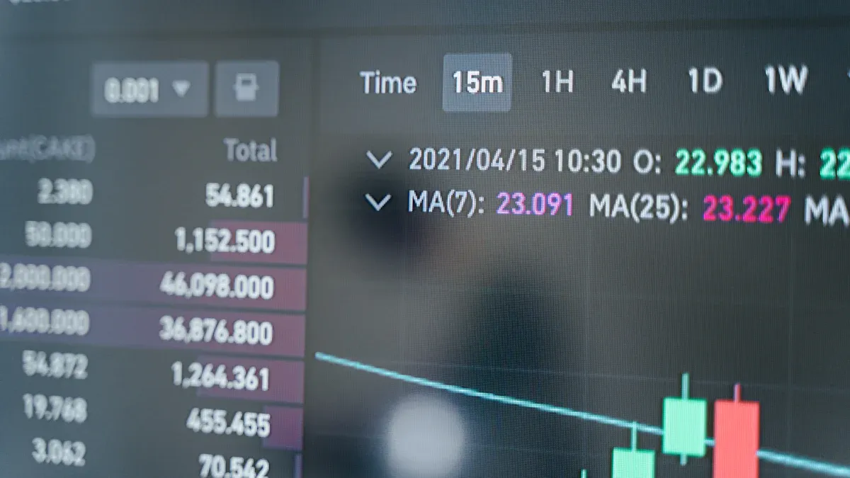
Image Source: pexels
Moving averages (MA) are one of the most basic and popular tools in technical analysis. They smooth out price fluctuations, helping you identify market trends more clearly. Mastering MA usage is crucial when analyzing US stock real-time quotes.
Core Function: Identifying Long-Term and Short-Term Trends
Moving averages display a smooth trend line by calculating the average stock price over a specific period. Short-term MAs (such as 10-day, 20-day) react quickly to price changes, suitable for capturing short-term movements. Long-term MAs (such as 50-day, 200-day) react more slowly, better revealing the dominant long-term trend.
Professional traders choose different MA combinations based on their trading style.
| Trading Type | Common Short-Term MA | Common Long-Term MA |
|---|---|---|
| Swing Trading | 20-day, 50-day | 200-day |
| Position Trading | 50-day | 100-day, 200-day |
Tip: Professionals do not rely on just one moving average. They use multiple periods to create a comprehensive view of market dynamics across different time frames.
Practical Application: Golden Cross and Death Cross
The “golden cross” and “death cross” are two very famous trading signals formed by the crossover of short-term and long-term MAs.
- Golden Cross (Bullish Cross): Occurs when a short-term MA (such as 50-day MA) crosses above a long-term MA (such as 200-day MA) from below. This is usually seen as a strong buy signal, indicating the market may enter a long-term uptrend.
- Death Cross (Bearish Cross): Occurs when a short-term MA crosses below a long-term MA from above. This is regarded as a clear sell signal, warning that the market may turn into a long-term downtrend.
Taking Tesla (TSLA) as an example, its stock price clearly demonstrated the power of the death cross:
- Tesla stock experienced a “death cross” in May 2022.
- After this signal appeared, its stock price fell about 54% in the following months, bottoming out in January 2023.
This historical case tells you that paying attention to these key crossover points can help you avoid major risks in advance when analyzing US stock real-time quotes.
Key Levels: Support and Resistance Role of MAs
In addition to indicating trend direction, moving averages also act as dynamic support and resistance levels on charts.
- In an uptrend, stock prices often find support near the lower moving average (such as 50-day MA) during pullbacks, then continue rising.
- In a downtrend, stock prices encounter resistance at the moving average during rebounds, then turn downward.
For example, the SPDR S&P 500 ETF (SPY) encountered strong resistance near the 50-day moving average during its rebound at the end of April 2024, then fell again. This clearly shows that moving averages can act as dynamic resistance preventing further price rises. Observing the interaction between price and MAs is an important technique for judging whether a trend can continue.
Tip 2: Using Relative Strength Index (RSI) to Capture Market Sentiment
If you want to know whether the market is “overheated” or “overcooled,” the Relative Strength Index (RSI) is your powerful tool. It is a momentum oscillator indicator, helping you measure the speed and magnitude of price changes, like a “speedometer” for market sentiment.
Core Function: Measuring Price Momentum
RSI calculates a value between 0 and 100 by comparing the relative strength of price gains and losses over a specific period (usually 14 days). This value reflects the comparison between buyer and seller strength.
- When the RSI value rises, it indicates strengthening buyer power and sufficient upward momentum.
- When the RSI value falls, it means seller power is dominating, with weakening upward momentum or strengthening downward momentum.
In simple terms, RSI tells you how much “strength” is behind the current trend.
Practical Application: Identifying Overbought and Oversold Zones
The most direct application of RSI is identifying extreme market sentiment states, namely “overbought” and “oversold.” This is a common method for swing traders seeking short-term opportunities.
Trading Signal Interpretation:
- Overbought Zone: When the RSI reading is above 70, it indicates the stock has risen too quickly recently, market sentiment may be overly optimistic, and a pullback could occur at any time. This can be seen as a potential warning or sell signal.
- Oversold Zone: When the RSI reading is below 30, it indicates the stock has fallen too much recently, market sentiment may be overly pessimistic, and a rebound is possible. This can be seen as a potential buy opportunity.
By observing whether RSI enters these two key zones, you can better grasp short-term market turning points.
Note: Trade with the Trend, Avoid Counter-Trend Operations
Please remember that RSI is a supplementary indicator, not a standalone crystal ball. A common mistake is selling immediately just because RSI enters the overbought zone above 70 during a strong uptrend.
In a strong bull market, a stock’s RSI may stay in the overbought zone for weeks or even months, while its price continues to hit new highs. If you exit too early, you will miss most of the profits.
Key Tip: Treat RSI as a confirmation signal, not the primary decision basis. When the market is in a clear trend, go with the trend. Your decision success rate will be higher only when RSI signals align with signals from other indicators (such as moving averages or price patterns).
Tip 3: Using Volume to Verify Price Validity
If price charts tell you what the market is doing, then volume tells you how strongly the market believes in it. Volume represents the number of shares traded in a specific period and is a key indicator for measuring market participation and sentiment intensity. Learning to interpret it allows you to effectively filter out much market “noise.”
Core Function: Confirming Trend and Breakout Strength
The core function of volume is to verify the validity of price movements. A healthy, sustainable trend, whether up or down, should have volume support.
When the stock price breaks through a key resistance level with significantly increased volume, it indicates strong buying interest and broad participation. Such a breakout is more likely to be genuine and lasting. Conversely, if the breakout occurs with flat or shrinking volume, it shows low market acceptance of the new price, possibly a trap.
Volume is the “fuel” for price movements. Price rises without volume support are like a sports car without gas—it won’t go far.
Practical Application: Interpreting “Volume-Price Relationship”
The interaction between price and volume, known as the “volume-price relationship,” provides rich market information. Here are the four most basic relationships you need to remember:
- Price Up, Volume Up: This is the healthiest bullish signal. Price rises with increasing volume, indicating active buying and potential trend continuation.
- Price Up, Volume Down: This is a warning signal. Price rises but volume shrinks, showing weakening chasing interest and possible lack of follow-through.
- Price Down, Volume Up: This is a clear bearish signal. Price falls with increasing volume, indicating strong selling pressure and spreading panic.
- Price Down, Volume Down: This indicates weakening selling pressure. After a prolonged decline, this may signal the market nearing a bottom with reversal potential.
Key Tip: Identifying True vs. Fake Breakouts
One of the most frustrating things in trading is chasing a “fake breakout.” The price seems to break a key level but quickly falls back. Volume is your most effective tool for identifying true vs. fake breakouts.
Key Rule: Genuine breakouts almost always come with a sharp volume surge. A reliable rule of thumb is that breakout day volume should be at least 50% higher than the average over the past 20 days.
When you see the price breaking an important resistance level, immediately check the volume bars below.
- If volume surges: This indicates large funds (often including institutional investors) are entering, making a genuine breakout highly likely.
- If volume is lackluster or normal: Be highly cautious. This is likely a “illusion” created by a few traders, lacking market consensus, with price reversal possible at any time.
By developing the habit of verifying volume, you can greatly improve trading decision success rates and avoid being misled by false market signals.
Tip 4: Using MACD to Detect Momentum and Divergence
The Moving Average Convergence Divergence (MACD) is a powerful tool because it combines the advantages of trend following and momentum analysis. If you want to understand both trend direction and current momentum strength, MACD is your preferred indicator. It smooths price data to provide clearer trading signals.
Core Function: Smoothing Trend and Momentum Signals
MACD consists of three core components, each with its unique function. Understanding them is the first step to mastering this indicator.
| Component | Description | Function |
|---|---|---|
| MACD Line | Difference between 12-period EMA and 26-period EMA | Indicates short-term momentum and trend direction |
| Signal Line | 9-period EMA of the MACD Line | Slow version of MACD Line, used to generate crossover signals |
| Histogram | Difference between MACD Line and Signal Line | Visually shows strengthening or weakening momentum |
These three components work together to provide a complete view of market momentum changes.
Practical Application: Fast and Slow Line Crossover Signals
The most basic use of MACD is observing crossovers between the MACD line (fast line) and the signal line (slow line). This provides direct buy/sell signals.
Trading Signal Interpretation:
- Bullish Crossover: When the blue MACD line crosses above the orange signal line from below, it indicates strengthening upward momentum. This is usually seen as a potential buy signal.
- Bearish Crossover: When the MACD line crosses below the signal line from above, it indicates dominating downward momentum. This can be a potential sell or warning signal.
You can assist judgment by observing histogram changes. When the histogram turns from negative to positive, it confirms the validity of the bullish crossover.
Advanced Tip: Using Bullish/Bearish Divergence for Warnings
Divergence is a powerful warning signal provided by MACD, helping you detect potential trend reversals in advance.
- Bearish Divergence: Occurs when price makes a new high, but MACD does not make a corresponding new high. This indicates weakening upward momentum, with the trend possibly reversing downward soon.
- Bullish Divergence: Occurs when price makes a new low, but MACD forms a higher low. This indicates weakening selling pressure, with the market possibly bottoming and rebounding soon.
Combination Strategy: To improve accuracy, combine MACD divergence signals with RSI. For example, when MACD shows bearish divergence and RSI is in the overbought zone above 70, the probability of trend reversal greatly increases.
Tip 5: Using Bollinger Bands to Assess Volatility
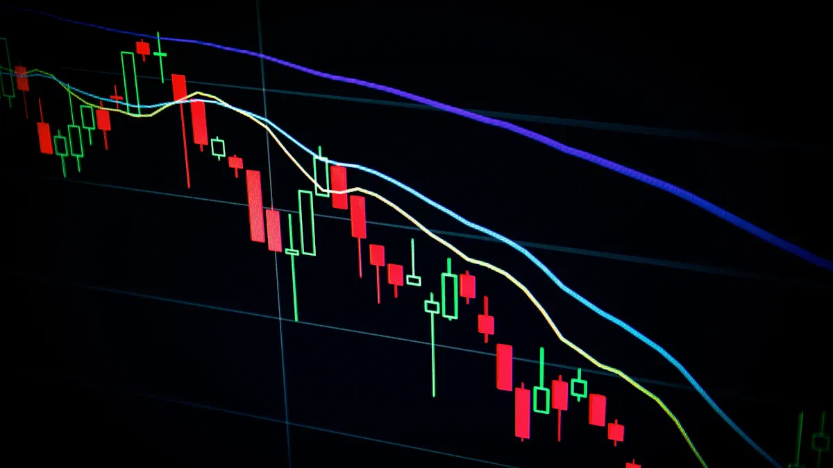
Image Source: unsplash
When you want to understand how volatile a stock’s price is, Bollinger Bands are an excellent tool. They consist of three bands surrounding the price, providing a dynamic price channel. This channel helps you judge whether the current price is high or low relative to recent history.
Core Function: Judging Price Volatility Range
The core of Bollinger Bands is measuring market volatility. They consist of a middle moving average and upper/lower standard deviation bands.
| Band Type | Calculation Method |
|---|---|
| Middle Band | Usually a 20-period simple moving average (SMA). |
| Upper Band | Middle Band + (2 standard deviations). |
| Lower Band | Middle Band - (2 standard deviations). |
When market volatility is high, the distance between upper and lower bands widens; when calm, it narrows.
Practical Application: Using Bands to Judge Support and Resistance
You can treat the upper and lower Bollinger Bands as dynamic support and resistance levels. This method is especially effective in ranging markets.
Trading Rule Interpretation:
- When price touches the upper band, it indicates relatively high price, forming resistance here.
- When price touches the lower band, it indicates relatively low price, forming support here.
- The middle band acts as secondary support or resistance.
For example, when price touches the lower band and shows a bullish candlestick pattern, it may be a potential buy signal. Conversely, when price touches the upper band with a bearish candlestick, it is a warning signal.
Warning Signal: “Squeeze” Predicts Directional Breakout
One of the most powerful signals from Bollinger Bands is the “squeeze.” When you see the upper and lower bands sharply narrowing, as if squeezing the price, this is an important warning signal.
Founder John Bollinger noted that low volatility periods are often followed by high volatility periods.
The squeeze itself does not provide direction, but it signals an impending sharp price movement. What you need to do is wait patiently for the breakout:
- If price strongly breaks above the upper band after a squeeze, it usually signals the start of a new uptrend.
- If price breaks below the lower band, it may indicate the start of a downtrend.
By identifying squeezes, you can prepare in advance for the market’s next big move.
You now master the core tools for judging trends, momentum, market sentiment, and volatility. These tips will help you analyze US stock real-time quotes more clearly.
The most important principle is: Any single indicator has limitations. The best strategy is to comprehensively use multiple indicators for cross-verification. For example, combine trend indicators (such as moving averages) with momentum indicators (such as RSI), to find converging signals.
We encourage you to apply the learned tips in practice. When analyzing US stock real-time quotes, combine different time frames (such as weekly and daily charts) for comprehensive analysis. Weekly charts reveal macro trends, while daily charts help grasp precise entry timing. Ultimately, you will form your own trading system.
FAQ
Which Technical Indicator is the Best?
There is no “best” indicator. Each has its unique perspective and limitations.
The smart approach is to combine trend indicators (such as MA) with momentum indicators (such as RSI). When multiple indicators give consistent signals, your trading decisions will be more reliable.
Which Time Frame Should I Use?
The time frame you choose depends on your trading style. Long-term investors focus on weekly charts, while short-term traders rely more on daily or hourly charts.
| Trading Style | Recommended Chart Time Frame |
|---|---|
| Position Trading | Weekly, Monthly |
| Swing Trading | Daily, 4-Hour |
| Day Trading | 1-Hour, 15-Minute |
What If Different Indicators Give Conflicting Signals?
This is an important warning signal, indicating unclear market direction.
The best strategy at this time is to stay patient and sit on the sidelines. You should wait for multiple indicators to give consistent signals before making decisions, avoiding risks in uncertain markets.
*This article is provided for general information purposes and does not constitute legal, tax or other professional advice from BiyaPay or its subsidiaries and its affiliates, and it is not intended as a substitute for obtaining advice from a financial advisor or any other professional.
We make no representations, warranties or warranties, express or implied, as to the accuracy, completeness or timeliness of the contents of this publication.
Related Blogs of

US Stock Broker Opening Guide: Fees, Security, and App Experience Comparison (Futu vs Tiger vs Firstrade)


In-Depth Analysis of US GDP: Comprehensive Insights from Consumption to Investment


2026 Latest US Stock Broker Review: Which is Better in Features and Fees - IB, Futu, or Tiger Securities


US-China Trade War Enters New Phase: How the Tech Industry Can Respond to Supply Chain Impacts
Choose Country or Region to Read Local Blog

Contact Us


BIYA GLOBAL LLC is a licensed entity registered with the U.S. Securities and Exchange Commission (SEC No.: 802-127417); a certified member of the Financial Industry Regulatory Authority (FINRA) (Central Registration Depository CRD No.: 325027); regulated by the Financial Industry Regulatory Authority (FINRA) and the U.S. Securities and Exchange Commission (SEC).
BIYA GLOBAL LLC is registered with the Financial Crimes Enforcement Network (FinCEN), an agency under the U.S. Department of the Treasury, as a Money Services Business (MSB), with registration number 31000218637349, and regulated by the Financial Crimes Enforcement Network (FinCEN).
BIYA GLOBAL LIMITED is a registered Financial Service Provider (FSP) in New Zealand, with registration number FSP1007221, and is also a registered member of the Financial Services Complaints Limited (FSCL), an independent dispute resolution scheme in New Zealand.