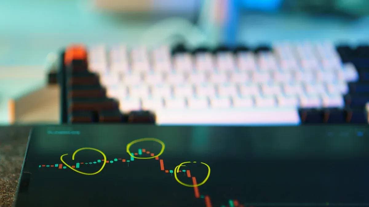
Want to Invest in Today's US Stocks? Start by Learning to Read Candlesticks and Volume


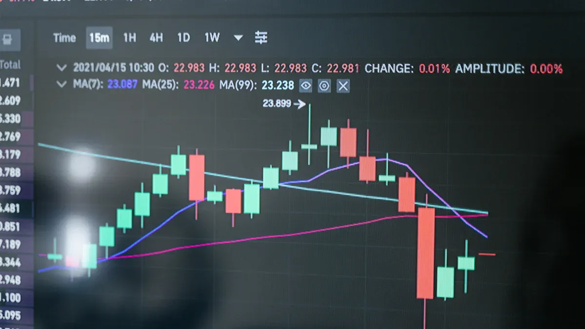
Image Source: pexels
Do you feel overwhelmed when analyzing today’s US stocks and facing complex charts without knowing where to start? Actually, the first step to understanding charts is simple. You need to learn to interpret two key pieces of information: candlesticks and volume.
One common mistake many beginner investors make is ignoring volume confirmation, which can lead to misinterpreting the strength of price movements.
You can think of candlesticks as the “price storybook,” recording a stock’s daily journey. Volume acts as the “market voter,” revealing the balance of power between buyers and sellers. By combining the two, you gain the foundation for judging trends.
Key Points
- Candlestick charts show stock prices. They include open, close, high, and low prices. Green candlesticks indicate rises, red ones indicate falls.
- Volume shows the number of shares traded. It helps us understand market strength. High volume indicates active market and more reliable trends.
- Combine candlesticks and volume for market analysis. For example, rising prices with increasing volume indicate a healthy uptrend.
- Identify key candlestick patterns and price-volume relationships. This can help predict whether prices will rise or fall. For instance, rising prices with shrinking volume may signal weakening upward momentum.
- When analyzing stocks, also consider the broader market and sectors. Market trends affect all stocks. Choosing strong sectors can improve investment success rates.
Candlestick Basics: Understanding the Language of Price
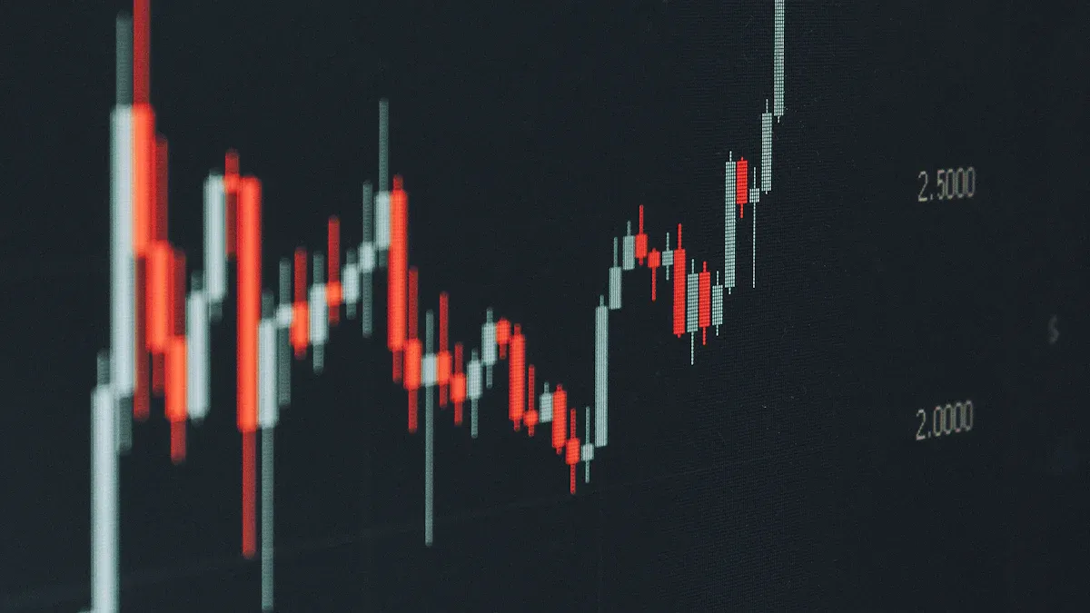
Image Source: pexels
Candlestick charts, also known as candlestick charts, originated in 18th-century Japan. A rice merchant named Munehisa Homma invented them to analyze rice price fluctuations. Later, Steve Nison introduced them to the Western world, making them a universal tool in modern financial analysis.
What is a Candlestick? Understanding the Four Core Prices
Each candlestick is a snapshot of price movement over a time period (such as a day or an hour). You need to understand its four core prices:
- Open Price: The first transaction price at the start of the period.
- Close Price: The last transaction price at the end of the period.
- High Price: The highest transaction price during the period.
- Low Price: The lowest transaction price during the period.
These four prices form the two main parts of a candlestick:
- Body: The rectangle formed by the open and close prices. It tells you the dominant force in price rise or fall.
- Wicks: Thin lines extending up or down from the body. The top of the upper wick is the high price, the bottom of the lower wick is the low price.
US Stock Candlestick Colors: Green for Rise, Red for Fall Rule
When analyzing US stocks, the color rule is very intuitive, but remember it may differ from other markets.
US Stock Market Tip
- Green Candlestick: Represents a rise. Close price higher than open price.
- Red Candlestick: Represents a fall. Close price lower than open price.
This is the opposite of the red for rise, green for fall rule in mainland China, Japan, and other Asian markets.
From Single to Combinations: Identifying Key Patterns
Single candlesticks or combinations can form specific “patterns” to help predict future price movements. As a beginner, start by recognizing these most basic patterns:
- Single Candlestick Patterns:
- Hammer: Usually appears at the bottom of a downtrend, with a small body but long lower wick. It suggests price may bottom and rebound.
- Shooting Star: Opposite of hammer, usually at the top of an uptrend. It signals weakening upward momentum and possible pullback.
- Candlestick Combination Patterns:
- Bullish Engulfing: A large green candlestick completely “engulfs” the previous smaller red one. This is a strong bullish reversal signal.
- Bearish Engulfing: A large red candlestick completely “engulfs” the previous smaller green one. This is a strong bearish reversal signal.
Learning to recognize these basic patterns is your first step in technical analysis.
Volume: Insight into True Market Strength
If candlesticks are the price storybook, then volume is the “reader vote count” for that book. It tells you the market’s true reaction to the “story.” A big green candlestick is exciting, but without sufficient volume support, the uptrend story may not be solid.
Why is Volume So Important?
Volume refers to the total number of shares traded in a specific period (such as a day). It is a key indicator because it reveals market activity and trend reliability.
Volume is like “fuel” for trends. A trend needs sufficient volume to sustain itself over distance.
You can understand it this way:
- Confirm Trend Strength: When prices rise with increasing volume, it means many buyers are entering, supporting the rise. Conversely, falling prices with increasing volume indicate heavy selling pressure.
- Validate Key Breakouts: When price breaks an important resistance level with volume far above average (e.g., exceeding the past 20-day average), the breakout is more credible. This shows market consensus on the new price.
Price-Volume Relationships: Four Classic Combinations
The relationship between price and volume is called “price-volume relationship.” It is core to technical analysis. Master these four classic combinations for deeper market insight.
| Price-Volume Combination | Market Signal | Practical Implication |
|---|---|---|
| Rising Price, Increasing Volume | Healthy Uptrend | Price rises with expanding volume. This is the ideal uptrend pattern, indicating active buying and likely trend continuation. |
| Rising Price, Decreasing Volume | Weakening Upward Momentum | Price continues rising but volume shrinks. This is a warning signal, suggesting insufficient chasing interest; trend may reverse or consolidate soon. |
| Falling Price, Increasing Volume | Panic Downtrend | Price falls with expanding volume. This usually means panic selling, heavy selling pressure, and downtrend hard to reverse short-term. |
| Falling Price, Decreasing Volume | Exhausting Downward Momentum | Price continues falling but volume shrinks. This indicates weakening selling power and growing reluctance to sell; price may approach bottom. |
By observing these four combinations, you can better judge current trend health and find stronger basis for next trading decisions.
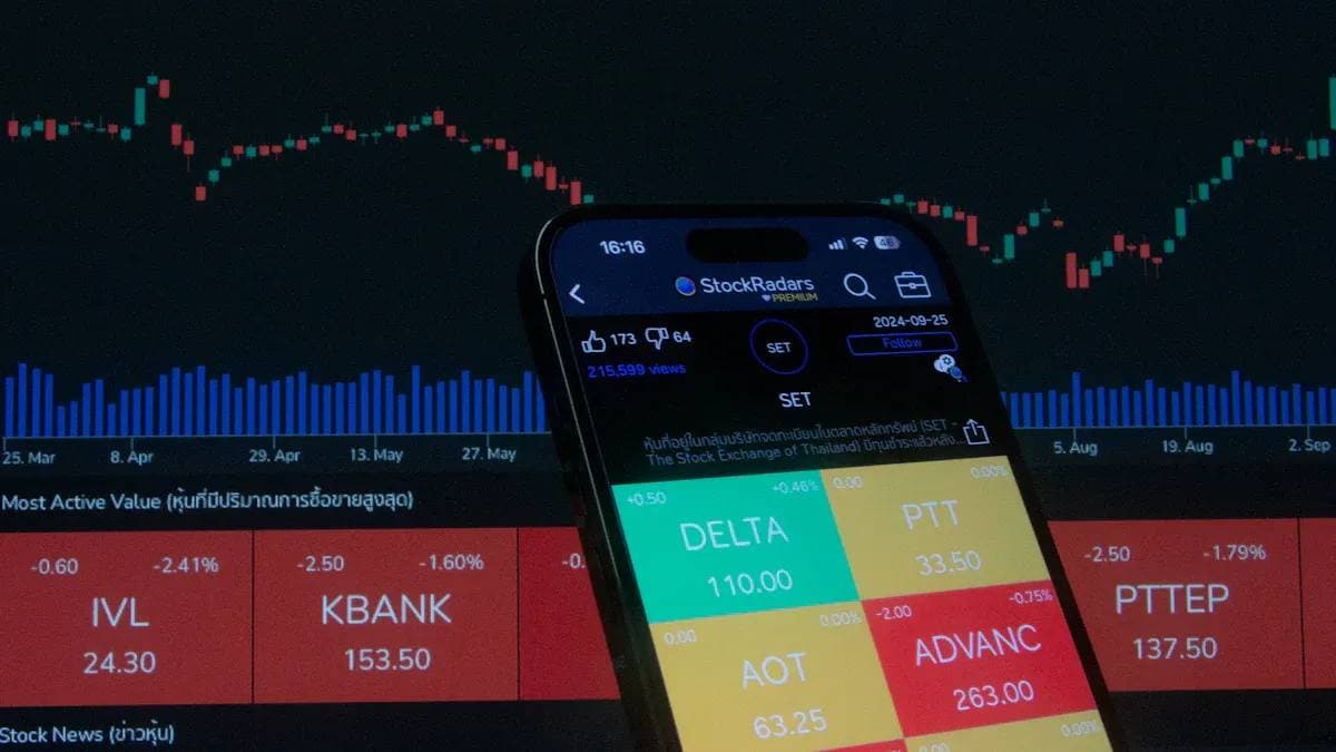
Candlesticks and Volume: Practical Combined Analysis
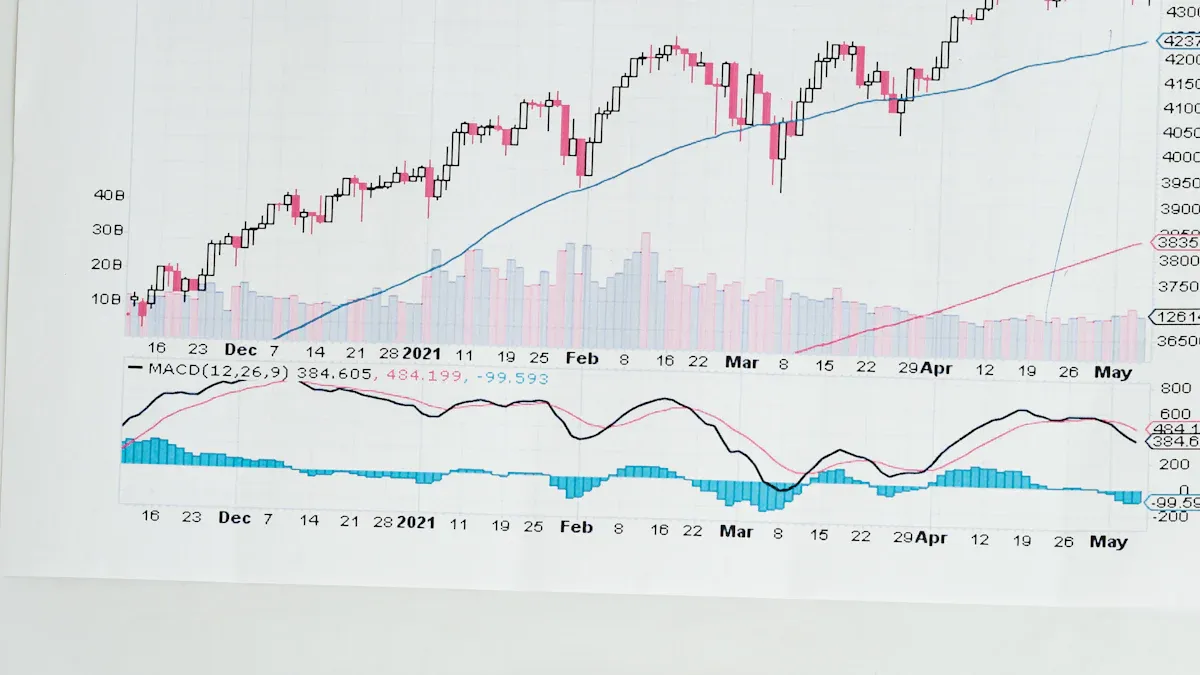
Image Source: pexels
You’ve learned the basic language of candlesticks and volume. Now, combine them like a detective searching charts for clues. True analytical power comes from combination, not isolation.
Identifying Uptrend Signals
A healthy uptrend is like steadily climbing stairs. Price creates “higher highs” and “higher lows.” Candlesticks and volume give clear signals in this process.
The ideal pattern is rising price with increasing volume. When price hits new highs with expanding volume, it shows continuous new buyers entering, powering the rise.
Practical Tip: Combine with Moving Averages (Moving Averages)
Moving averages help identify trend direction and dynamic support. In uptrends, price usually runs above the moving average.
Consider a specific example. Suppose a stock (like NVDA) strongly breaks a consolidation zone with huge volume.
- Breakout: First breakout with massive volume, forming a strong large green candlestick.
- Pullback: Price briefly pulls back, candlestick body small, volume clearly shrinking. This shows minimal selling pressure, just temporary profit-taking.
- Support: During pullback, price falls to near the 10-day moving average and finds support, stopping decline.
- Confirmation: Price then rises again with volume, hitting new highs.
This “high-volume breakout + low-volume pullback + MA support” combination is a very reliable uptrend confirmation signal and good potential buy point.
| Indicator | Volume Confirmation | Signal Strength |
|---|---|---|
| Moving Average Support | Shrinking volume on pullback | Moderately Strong |
| Key Level Breakout | Massive volume increase on breakout | Strong |
Beware of Top Reversal Signals
No trend lasts forever. When upward momentum weakens, charts show warning signals that risk is building. Recognizing them helps protect profits and avoid buying at peaks.
One most critical warning is price-volume divergence (Price-Volume Divergence).
When price hits new highs but volume fails to follow, instead getting lower each time. This is like a car accelerating but easing off the gas. It indicates weakening buying power driving the rise; trend likely to reverse soon.
Beyond divergence, watch for classic top candlestick patterns. When appearing at uptrend ends, they are strong warnings.
- Shooting Star: Small body but long upper wick. Buyers tried pushing higher but were beaten back by strong sellers.
- Evening Star: Three-candlestick pattern: large green, then doji or small body, finally large red. Symbolizes shift from light (rise) to darkness (fall).
- Bearish Engulfing: Huge red candlestick fully covers previous green one. Sellers overwhelmed buyers in one day.
- Three Black Crows: Three consecutive declining red candlesticks. Indicates sustained selling pressure; downtrend may start.
History doesn’t repeat exactly but rhymes. For example, in January 2022, the S&P 500 formed a Double Top Pattern (key top reversal) on daily chart, starting a months-long bear market with over 25% decline. These signals deserve high attention.
Finding Key Support and Resistance Levels
Price doesn’t move in straight lines but fluctuates between “floors” and “ceilings.” The “floor” is support level, the “ceiling” is resistance level.
- Support Level: When price falls to a level, buying strength increases, stopping further decline.
- Resistance Level: When price rises to a level, selling strength increases, stopping further rise.
Find these key levels via:
- Historical Price Analysis: Look for areas on charts where price reversed multiple times or lingered long. For example, if a stock repeatedly bounces at $50, $50 is strong support.
- Technical Indicators: Moving averages act as dynamic support in uptrends, dynamic resistance in downtrends.
- Psychological Levels: Round numbers like $50, $100, $200 often become natural support/resistance due to trader psychology.
Volume changes are crucial when price nears these levels.
Breakout Confirmation Rule
When price breaks upward through important resistance, it must have far above average volume (e.g., over 50% higher than past 20-day average). This proves market consensus on new price—a true breakout. Low volume likely a “false breakout”, price soon falling back below resistance.
For those wanting advanced skills, learn Fibonacci Retracement (Fibonacci Retracement) tool. It predicts potential support/resistance by calculating key percentages (e.g., 38.2%, 50%, 61.8%). When these Fibonacci levels coincide with historical prices, their reliability as support/resistance greatly increases.
Analyzing Today’s US Stocks: Combine Market and Sector
You’ve mastered basic single-stock analysis, but that’s not enough. No stock moves independently of its “environment”—the broader market and sector. Combining them makes decisions more comprehensive.
Why Follow Broader Market Trends?
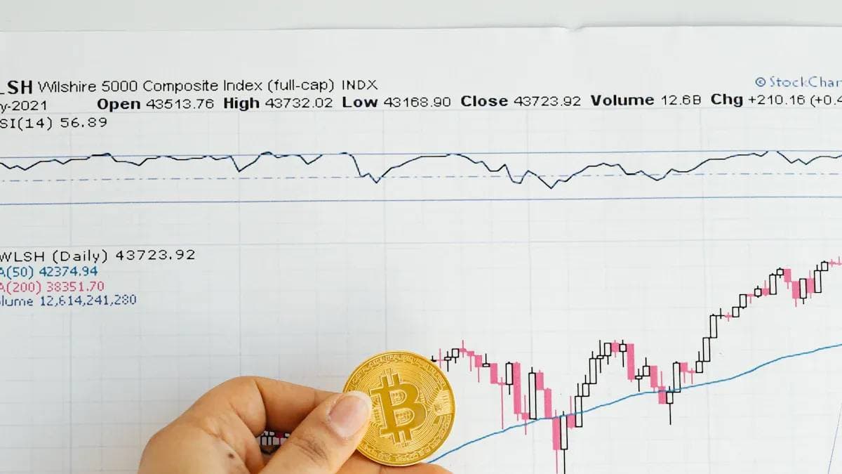
The “broader market” refers to overall performance, measured by major indices like S&P 500 (S&P 500), Nasdaq , and Dow Jones Industrial Average . Following it is crucial because “rising tide lifts all boats, falling tide lowers them.” In bull markets, most stocks rise; in bear markets, even best companies fall.
Historical data shows S&P 500 trends highly correlate with US economic health. Over long periods, stocks perform well in expansions, fall in recessions. Observing market helps judge macro risks for today’s US stock investments.
Analyzing market candlesticks and volume is like taking the market’s “pulse.” It helps judge overall sentiment—optimistic or pessimistic—deciding aggressive or defensive strategy.
How to Observe Sector Strength Changes?
Markets consist of “sectors” like technology, healthcare, finance, energy. Some always outperform others. Focusing capital on strong sectors significantly boosts today’s US stock investment success.
How to quickly identify leading vs. lagging sectors? Use free tools on professional finance sites like Barchart.
| Tool | Function |
|---|---|
| Sector Rankings | Rank all sectors by performance over periods (day, week, month) to spot leaders at a glance. |
| Sector Heatmap | Visually show sector short- and long-term performance with colors (usually green strong, red weak). |
| Stock Sector Finder | Enter any stock code to instantly see its sector and industry. |
These tools easily “navigate” today’s US stock opportunities, ensuring you sail with strongest currents.
You’ve now mastered candlesticks and volume basics. Successful investing needs broader view: combine technical signals with market environment and sector strength for complete strategy. Theory is first step; real progress comes from practice. Open your trading software now, like Biyapay, and verify/analyze real today’s US stock charts.
From today, start your chart analysis journey like a professional investor!
FAQ
Which timeframe candlestick chart should I look at?
Choice depends on trading style. Long-term investors usually use daily or weekly charts for big trends. Short-term traders may focus on 5-minute or 15-minute charts. Beginners start with daily charts to learn overall structure.
What if the candlestick body is very small, like a “cross”?
This is called a “doji” (Doji). It means open and close prices are nearly identical, market indecisive. Buyer and seller forces temporarily balanced. Often an early signal of potential trend change.
Besides candlesticks and volume, which indicators are worth learning?
Continue with momentum indicators like Relative Strength Index , or trend indicators like MACD. They provide additional perspectives. But master candlesticks and volume first, as they are price analysis foundation.
What if candlestick and volume signals conflict?
Conflict means market uncertainty; best to wait. For example, “rising price with shrinking volume” is a warning. Combine overall trend and key support/resistance for judgment, wait for clearer signals.
*This article is provided for general information purposes and does not constitute legal, tax or other professional advice from BiyaPay or its subsidiaries and its affiliates, and it is not intended as a substitute for obtaining advice from a financial advisor or any other professional.
We make no representations, warranties or warranties, express or implied, as to the accuracy, completeness or timeliness of the contents of this publication.
Related Blogs of
US Penny Stock Gold Rush: The Most Promising Potential Stocks to Watch in 2026

Best Free Real-Time US Stock Quote Websites Besides Yahoo Finance

Overcoming Human Weaknesses: Detailed Guide to Beginner-Friendly Automated US Stock Trading Strategies


Weekly US Stock Index Futures Review and Outlook: What Investors Should Focus On

Choose Country or Region to Read Local Blog

Contact Us


BIYA GLOBAL LLC is a licensed entity registered with the U.S. Securities and Exchange Commission (SEC No.: 802-127417); a certified member of the Financial Industry Regulatory Authority (FINRA) (Central Registration Depository CRD No.: 325027); regulated by the Financial Industry Regulatory Authority (FINRA) and the U.S. Securities and Exchange Commission (SEC).
BIYA GLOBAL LLC is registered with the Financial Crimes Enforcement Network (FinCEN), an agency under the U.S. Department of the Treasury, as a Money Services Business (MSB), with registration number 31000218637349, and regulated by the Financial Crimes Enforcement Network (FinCEN).
BIYA GLOBAL LIMITED is a registered Financial Service Provider (FSP) in New Zealand, with registration number FSP1007221, and is also a registered member of the Financial Services Complaints Limited (FSCL), an independent dispute resolution scheme in New Zealand.